
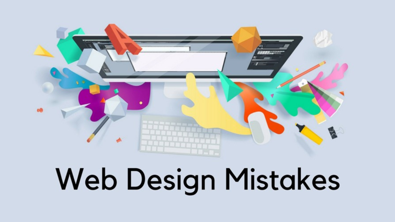
Your website is often the first impression potential customers have of your business. A well-designed website is user-friendly, visually appealing, and effectively communicates your brand message. However, even the most well-intentioned websites can fall victim to common design mistakes that can hinder user experience and ultimately hurt your business. Here we have listed some of the most common website design mistakes and provided actionable tips to avoid them.
Mistake #1: Poor Navigation and User Experience (UX):
- The Problem: Confusing navigation menus, cluttered layouts, and slow loading times can leave users frustrated and abandoning your website.
- The Solution: Prioritize user experience. Design a clear and intuitive navigation menu that allows visitors to find the information they need easily. Ensure a clean, uncluttered layout that prioritizes readability and functionality. Optimize website speed for fast loading times across all devices (desktop, tablet, mobile).
Mistake #2: Ignoring Responsive Design:
- The Problem: With the majority of web traffic now coming from mobile devices, a website that isn’t responsive (adapting to different screen sizes) will alienate a significant portion of your audience.
- The Solution: Implement responsive design principles. Ensure your website displays correctly and functions seamlessly across all devices, from desktop computers to tablets and smartphones. Utilize tools and frameworks specifically designed for responsive web design.
Mistake #3: Unclear Value Proposition and Messaging:
- The Problem: Visitors should be able to understand what your business does and the value you offer within seconds of landing on your website. Confusing or generic messaging can leave users unsure about your brand and ultimately lead them to a competitor’s website.
- The Solution: Craft a clear and concise value proposition that clearly communicates what your business does and the benefits it offers to customers. Use strong calls to action (CTAs) that tell users what you want them to do next (e.g., “Contact Us,” “Learn More,” “Shop Now”).
Mistake #4: Overlooking the Power of Visuals:
- The Problem: Low-quality images, irrelevant stock photos, and cluttered visuals can detract from the user experience and make your website appear unprofessional.
- The Solution: Invest in high-quality, professional images that are relevant to your brand and resonate with your target audience. Consider using original photography or high-quality stock photos with a specific style that complements your brand identity. Utilize white space effectively to create a clean and visually appealing layout.
Mistake #5: Neglecting Search Engine Optimization (SEO):
- The Problem: If your website isn’t optimized for search engines, potential customers searching for products or services you offer may never find you.
- The Solution: Implement basic SEO best practices. Conduct keyword research to identify relevant keywords your target audience uses and integrate them naturally into your website content. Optimize page titles and meta descriptions to improve search engine visibility. Consider building high-quality backlinks to your website from reputable sources.
Mistake #6: Ignoring Accessibility:
- The Problem: Websites that are not accessible to users with disabilities exclude a significant portion of the online population.
- The Solution: Prioritize website accessibility. Ensure your website meets accessibility standards by using proper coding techniques, providing alternative text descriptions for images, and utilizing clear and concise language.
Bonus Tip: A/B Testing for Continuous Improvement:
- The Key to Optimization: A/B testing allows you to compare different versions of website elements (e.g., headlines, CTAs, layouts) to see which ones perform better. Utilize A/B testing tools to continuously optimize your website for better user experience and improved conversion rates.
The Takeaway:
By avoiding these common website design mistakes and prioritizing user experience, clear communication, and search engine optimization, you can create a website that effectively attracts visitors, converts leads, and drives business growth. Remember, your website is a valuable asset, so invest the time and effort to ensure it delivers a positive and impactful experience for your target audience.
Ready to create a website that converts? WODO Digital can help! Our team of experienced web designers and developers can create a beautiful, user-friendly website that ranks higher in search results and drives results for your business. Contact us today and let’s discuss your website design needs!