Introduction
In a world where the first impression is often digital, web design stands at the forefront of how brands, businesses, and individuals are perceived. It’s not just about colors and layouts; It’s about creating an experience that speaks, connects, and converts. Web design crafts the visual and interactive side of a website, while web development brings it to life behind the scenes with code and functionality. One captures the eye, the other powers the experience, and together, they create the websites we use every day.
In this guide, we’ll walk you through everything from the building blocks of UI and UX design to the technicalities of front-end and back-end development. We’ll explore tools like Figma, React, and Node.js, dive into design principles, and layout learning paths and project ideas for beginners. Whether you’re an aspiring designer, a budding developer, or just curious about how websites work, this comprehensive guide will give you a clear, engaging look into the world of web design and development.
Key Takeaways
- Web Design Drives Digital Success: A well-crafted web design is essential for building a strong online presence, boosting credibility, and increasing conversions.
- Functionality Meets Aesthetics: A great website balances visual appeal with user-friendly functionality to ensure a seamless experience.
- Roles Matter in Web Design: UI, UX, and visual design each play a unique role in creating a website that looks great and performs well.
- Tools Are Key: Master tools like Figma, Adobe XD, and Webflow to bring your web design vision to life, whether you’re coding or using no-code platforms.
- Mobile Optimization is Critical: With mobile-first indexing, ensuring your website is responsive and mobile-friendly is a must for both user experience and SEO.
- Stay Updated with Trends: Embrace new trends like AI-powered tools, neumorphism, and AR/VR to create innovative, future-proof websites.
Table of Contents
Historical Evolution of Web Design

The Dawn of the Web: Static Pages and the Birth of HTML
In the early 1990s, web design was a bare-bones affair. Websites were simple, text-heavy, and largely static, built using HTML, the foundational language that gave structure to web pages. These digital documents were far from visually appealing, but they marked the beginning of a new era where information could be accessed from anywhere in the world.
As the internet gained popularity, so did the demand for more engaging online experiences. But in those early days, web pages lacked style, interactivity, and fluidity. The idea of design as we know it didn’t yet exist; Web creators were more focused on function than form.
Style Enters the Scene: The Rise of CSS and JavaScript
By the mid-to-late ‘90s, CSS (Cascading Style Sheets) emerged, transforming the internet from a sea of plain pages to more visually distinct websites. Designers could now control fonts, colors, spacing, and layout without touching the HTML structure, introducing style and personality into the web for the first time.
At the same time, JavaScript began enabling dynamic elements like sliders, dropdowns, and animations. This combo of HTML, CSS, and JavaScript laid the groundwork for more interactive and visually appealing web experiences, setting the stage for the web to evolve into something truly user-centric.
The Mobile-First Revolution: Designing for All Screens
As smartphones began dominating how people accessed the internet, web designers faced a new challenge: how to ensure websites looked great on both desktops and smaller screens. This sparked the mobile-first and responsive design movement, where flexibility and adaptability became core to every design decision.
Designers began embracing fluid grids, media queries, and scalable assets to make sure users had seamless experiences, no matter the device. Responsive design didn’t just change how sites looked; it redefined how designers approached problem-solving in a multi-device world.
Modern Trends & Frameworks: The Future is Now
Today’s web design is sleek, smart, and user-focused. Trends like minimalism, dark mode, micro-interactions, and immersive scrolling are redefining aesthetics, while usability remains king. Designers now aim to blend beauty with functionality, ensuring every element has purpose and impact.
Supporting this shift are powerful frameworks like Bootstrap, Tailwind CSS, and UI libraries that make building responsive, visually stunning websites faster and more efficient. With technologies like AI, Web 3.0, and motion design entering the scene, the future of web design promises even more personalization, interactivity, and innovation.
Key Components of Web Design
Visual Design: Where Aesthetics Meet Emotion
Imagine walking into a beautifully designed space; clean lines, tasteful colors, thoughtful placement of every element. That’s exactly what great visual design achieves on a website. It’s the first thing users notice, and it sets the tone for their entire experience.
Visual design includes layouts that guide the user’s eye, color palettes that evoke emotion, fonts that communicate personality, and images that tell stories. Even white space, the quiet background is a powerful design tool. It creates breathing room, enhances focus, and adds a sense of elegance. When used right, these elements work together like an orchestra, bringing harmony and clarity to the page.
UI (User Interface) Design: Making Interaction Effortless
While visual design draws users in, UI design keeps them engaged. It’s all about the interactive elements—buttons that feel clickable, menus that unfold intuitively, forms that are easy to fill, and icons that communicate without words. These are the tools users need to move through your site confidently.
A well-crafted UI is built on consistency and feedback. When every element follows a pattern, colors for clickable buttons, hover effects for links, loaders for actions; it becomes second nature to the user. And when the interface responds to user actions with subtle animations or confirmations, it builds trust. Great UI design makes digital interaction feel natural and almost invisible.
UX (User Experience) Design: Guiding the Journey
At the heart of every successful website lies thoughtful UX design. It’s the invisible thread that guides users smoothly from point A to point B; whether they’re making a purchase, reading a blog, or booking a service. Good UX isn’t just about structure, it’s about how the user feels while navigating your site.
This includes planning clear navigation, designing with accessibility in mind, and mapping the entire user journey from their first click to their final goal. User research is key here; understanding what your audience needs and how they behave. It’s not guesswork; it’s insight-driven design. When UX is done right, users don’t even notice it. They just flow effortlessly through a digital space that feels made just for them.
Differentiating Roles in Web Design
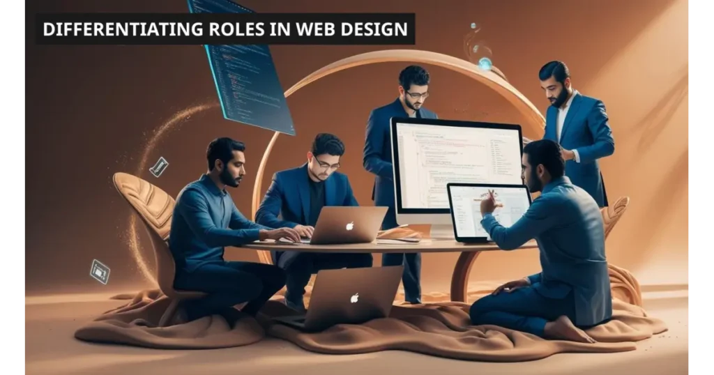
Web design is a symphony of creativity and functionality. But behind every beautifully crafted interface and seamless user journey are specialists. Each with a unique role, a specific set of tools, and a shared mission: to bring digital ideas to life. While their titles may sound interchangeable, the roles of Web Designer, UI Designer, UX Designer, and Visual Designer each have distinct flavors that come together like ingredients in a perfect recipe.
1. The Web Designer
Think of the web designer as a digital architect with an eye for design and a foot in the technical world. Their role bridges the gap between aesthetics and function, often combining visual design with a basic understanding of how code works. From designing layouts and selecting color palettes to ensuring responsiveness across devices, web designers shape the entire look and feel of a site.
Skill Set & Tools:
- Strong grasp of layout principles, color theory, and typography
- Familiarity with tools like Figma, Adobe XD, and Photoshop
- Often comfortable with HTML, CSS, and sometimes JavaScript
- Focus on building a functional, visually appealing layout
2. The UI Designer
Now enter the UI designer, the master of interactivity. If the web designer paints the room, the UI designer installs the light switches, the buttons, the drawers, and ensures everything is right where you expect it. Their job is to design every clickable and interactive element—menus, buttons, sliders, toggles—making sure they’re intuitive and consistent.
Skill Set & Tools:
- Expertise in interface design patterns and interaction design
- Tools like Sketch, Figma, and InVision for prototyping
- Focus on usability, visual consistency, and feedback mechanisms
- Works closely with developers to ensure their designs translate perfectly into code
3. The UX Designer
Behind the sleek visuals lies strategy. The UX designer is the researcher, the listener, the mapper of human behavior. They care about what users want, how they behave, and how to guide them through the website without friction. UX designers create wireframes, conduct user research, test user flows, and map the emotional journey of the user from start to finish.
Skill Set & Tools:
- Proficiency in user research, personas, and journey mapping
- Tools like Miro, Figma, Axure, and UserTesting
- Strong knowledge of accessibility, usability, and information architecture
- Constant testing, iterating, and improving based on real user data
4. The Visual Designer
While UI designers focus on the functionality of each element, visual designers focus on how they make users feel. They are the storytellers who bring brands to life through graphics, illustrations, icons, and motion. Their goal? To create a stunning visual experience that communicates personality, trust, and emotion—all at first glance.
Skill Set & Tools:
- Mastery of graphic design, branding, and composition
- Tools like Adobe Illustrator, After Effects, and Figma
- Deep understanding of visual storytelling and emotional engagement
- Ensures the website looks and feels aligned with the brand’s identity
How these roles collaborate in real-world projects?
Creating a website isn’t a one-person show ; It’s a collaborative performance where each designer plays a distinct role, contributing their expertise to build something cohesive and powerful. Here’s how they come together:
Step 1: UX Designer – Mapping the User’s Journey
The UX designer starts by researching the target audience and defining the user’s path. Wireframes, user flows, and experience mapping are their tools to ensure the structure makes sense and users don’t get lost.
Step 2: UI Designer – Designing the Interface
Once the path is clear, the UI designer steps in to make it visually intuitive. From buttons to navigation bars, they craft every element to feel natural, functional, and consistent across devices.
Step 3: Visual Designer – Adding Style and Emotion
Next comes the visual designer, infusing brand personality through colors, fonts, illustrations, and imagery. They ensure the site doesn’t just work; it feels right and reflects the brand’s voice.
Step 4: Web Designer/Developer – Making It Functional
The web designer and developers take these visuals and bring them to life through code. They ensure responsiveness, functionality, and performance, while working closely with the design team for a smooth rollout.
Essential Tools and Technologies
Every great web design project starts with the right toolkit; A combination of creative software, solid coding knowledge, and smart platforms that bring ideas to life. Whether you’re sketching out a layout or coding up a storm, these tools and technologies are the silent heroes behind every stunning website.
Design Tools
Before a single line of code is written, design tools help transform ideas into visuals. They’re where imagination meets structure; where colors, grids, and typography come to life.
- Figma – A cloud-based favorite for teams to collaborate in real-time, ideal for UI/UX design and prototyping.
- Canva – Great for quick visuals, marketing assets, and simple layouts, perfect for non-designers.
- Adobe XD – Powerful for interactive prototypes and high-fidelity mockups, especially if you’re in the Adobe ecosystem.
Languages & Tech
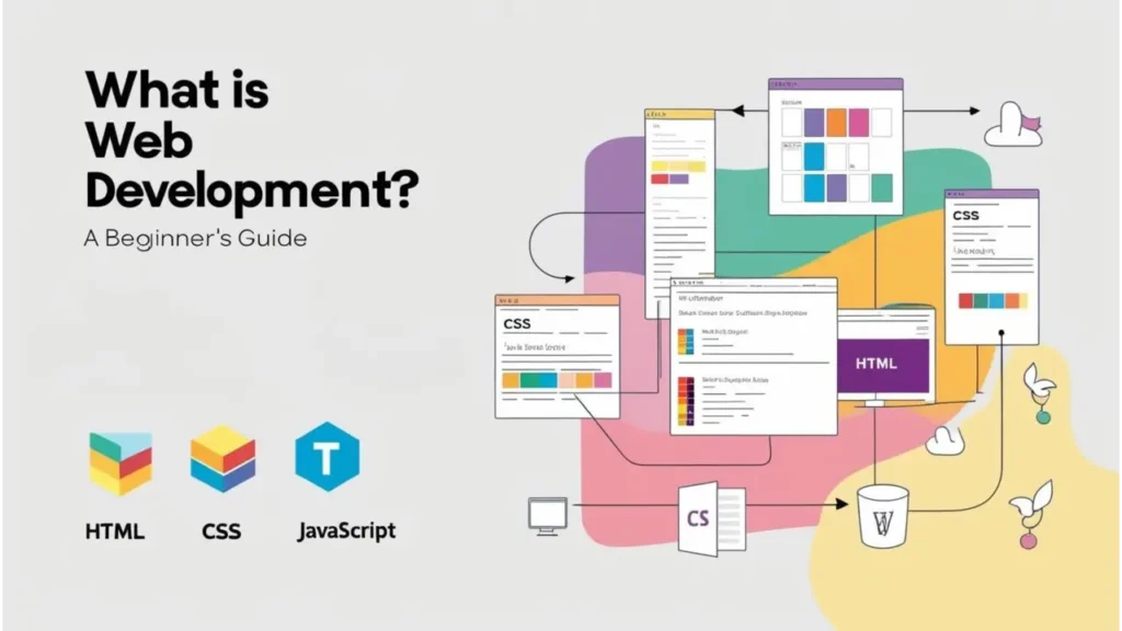
Design gets the attention, but code gives it power. HTML, CSS, and JavaScript are the essential trio that translates your design into a working, clickable website.
- HTML (HyperText Markup Language) – The backbone of any webpage; it structures content like text, images, and links.
- CSS (Cascading Style Sheets) – The stylist; it handles colors, spacing, typography, and layout styling.
- JavaScript – The brain; adds interactivity like sliders, animations, and form validations.
Frameworks
Frameworks make development faster and smoother by offering pre-written code and design patterns. They’re like cheat codes for developers.
- Bootstrap – A popular front-end framework with ready-to-use components and a responsive grid system.
- Tailwind CSS – Utility-first and highly customizable, ideal for developers who want design freedom without writing too much CSS.
No-Code Builders
Not everyone is a coder, and that’s okay. No-code builders empower creatives to build beautiful websites without writing a single line of code.
- Webflow – A powerful tool that combines design freedom with the ability to export clean code.
- Wix – Drag-and-drop simplicity with tons of templates for beginners.
- Squarespace – Sleek, modern templates with strong design aesthetics, perfect for portfolios and small businesses.
These tools don’t just make web design easier; They make it more accessible, efficient, and exciting. Whether you’re designing pixel-perfect interfaces or experimenting with code, the right tools can turn your ideas into interactive experiences.
“Want your brand to look great and perform even better online? Explore Wodo Digital’s Web Design & Branding Services or Custom Web Development Solutions to transform your vision into reality.“
Let’s build something amazing—together!
Principles of Effective Web Design
In the digital realm, first impressions aren’t made with a handshake—they’re made with a homepage. A website isn’t just a platform anymore; it’s a full-blown experience, often the first and most lasting interaction a customer has with a brand. This is why web design has shifted from being visually impressive to being strategically impactful. It’s no longer just about aesthetics; it’s about how well your design communicates, navigates, and serves. The following principles form the heart of what makes a design effective—in terms of both user satisfaction and business goals.
Simplicity, Clarity, and Visual Hierarchy
In a world flooded with information, clarity is a luxury and simplicity is the tool that gets you there. Users don’t want to work hard to understand your message or find what they’re looking for. A visually simple website declutters the path and focuses on functionality. That doesn’t mean boring, it means being intentional with every element. Typography, whitespace, icons, and layout should guide rather than distract. Simplicity is what keeps users grounded and focused.
Visual hierarchy plays the role of a silent guide, leading your visitor’s eyes from what’s most important to what’s next. It’s not just about what’s on the page; it’s about where and how it appears. Using size, contrast, alignment, and positioning, designers can prioritize content. Think of your website as a storybook. Titles should shout, subtext should whisper, and visuals should carry emotion. The better the hierarchy, the more intuitive the experience.
Mobile Responsiveness
With over half of global web traffic coming from mobile devices, a website that doesn’t function well on smartphones is like a store with a locked front door. Mobile responsiveness ensures that your content looks and works great across all screen sizes; From the tiniest smartphone to the widest desktop monitor. It’s about creating a flexible layout that adapts, resizes, and reflows depending on the user’s device.
But it goes beyond layout alone. Buttons should be tap-friendly. Navigation should be thumb-accessible. Text should remain legible without zooming. This requires thoughtful design decisions backed by CSS media queries, fluid grids, and scalable assets. A responsive site isn’t just a bonus; It’s a baseline. It tells your audience, “We’re here for you, wherever you are.”
Accessibility & Inclusive Design
A great website should be usable by everyone, including people with disabilities. Accessibility is not an optional feature or a compliance checkbox; It’s a design mindset rooted in empathy. From color contrast that assists the visually impaired to semantic HTML that aids screen readers, inclusive design creates a smoother, more welcoming experience for all users.
Accessibility also enhances usability for everyone. For instance, captions on videos help users in noisy environments, and larger touch targets assist users with limited dexterity. Inclusive design means designing with users in mind, not just for them. It’s a commitment to universal access; because everyone deserves to benefit from the web, regardless of ability or context.
Consistency in Branding and Tone
Consistency is what transforms a series of pages into a recognizable digital identity. Every font, color, button shape, and piece of copy plays a role in building trust and recognition. If each page on your site feels like it was made by a different person, users won’t know what your brand stands for. Cohesive branding; Visually and verbally is like a signature that reinforces your personality and values.
Consistency also improves usability. When users know how elements behave and where they belong, they can interact more confidently and efficiently. A consistent tone of voice in content whether professional, playful, or empathetic helps build emotional connections. It’s about shaping a unified experience that not only looks good but feels reliable at every touchpoint.
Fast Loading and Optimized Assets
We live in a world of instant gratification. If your website takes more than a few seconds to load, users are more likely to bounce than wait. Performance directly impacts engagement, SEO rankings, and conversion rates. A beautiful website is only effective if people stick around long enough to see it. That’s where speed optimization becomes non-negotiable.
Optimizing your assets; compressing images, minimizing code, using efficient hosting, and implementing caching, can drastically improve performance. Lazy loading content helps by only rendering what’s needed when it’s needed. Clean code practices and CDN integrations can further enhance delivery. A fast site isn’t just better for users; it’s better for business.
What is the the Web Design Process?
Creating a website is much like building a house. It’s a step-by-step journey that starts with a strong foundation and ends with a polished masterpiece. A well-thought-out web design process ensures that each stage is handled with precision, ensuring that the final product is not only functional but visually appealing and user-friendly. Here’s a deep dive into the stages that make up the web design process. Each essential for crafting a site that meets both user expectations and business goals.
1. Research & Discovery
Before embarking on any design project, the first crucial step is understanding the project’s goals, target audience, and user needs. The research phase is all about gathering insights that will inform the design decisions to come. What problem are we solving for the user? What are the business goals? Who is the competition, and what are they doing right (or wrong)? This phase involves user research, market analysis, and gathering inspiration from existing web design trends.
This phase also includes defining the website’s functionality; whether it’s an e-commerce platform, a blog, or a portfolio site. In short, research is about laying the groundwork to ensure that design is not only aesthetically pleasing but also strategically aligned with both user needs and business objectives. Think of this as the blueprint before the first line of code is written or graphic designed.
2. Wireframing & Prototyping
Once the groundwork is laid, it’s time to start sketching out how the website will look and function. Wireframing is where the architecture of the website takes shape. It’s the skeleton—the basic layout, without any design elements. At this stage, designers focus on structuring the site’s content, navigation, and interface without worrying about colors, fonts, or images. It’s all about establishing the flow of information.
Prototyping takes wireframing one step further. This is where you create an interactive model of the site, so stakeholders and users can experience how the final product might feel. Prototypes are clickable, allowing you to test out navigation, user interactions, and the general feel of the website. Testing prototypes at this stage can save a lot of time and frustration by uncovering potential issues before any visual design or development begins.
3. Visual Design and Brand Application
Now comes the fun part; The visual design. This is where the website takes on personality, style, and flair. Designers apply colors, typography, and branding elements to the wireframe to create a visual identity that resonates with the target audience. Whether it’s a sleek, modern aesthetic or a fun and playful vibe, the visual design should align with the brand’s overall identity and appeal to the users.
But it’s not just about looking pretty. The visual design also ensures that the site’s usability and functionality remain top priorities. Designers take into account the balance between aesthetics and user experience, ensuring that the layout doesn’t just look good but also works well in terms of usability and accessibility. At this stage, the design should be fully representative of the brand’s values and communicate a sense of trust and professionalism.
4. Development Handoff or No-Code Implementation
Once the design is approved, the project moves into the development stage. If you’re working with developers, this is where the design files are handed off. Developers take the visual designs and convert them into code, bringing the site to life. The front-end development focuses on what the user sees and interacts with, using technologies like HTML, CSS, and JavaScript. The back-end development, on the other hand, powers the site’s functionality, databases, and server-side logic.
In cases where no-code solutions are preferred (especially for simpler websites or quick MVPs), platforms like Webflow or Wix come into play. These tools allow designers to implement the design directly without having to write a single line of code. While these tools offer ease and speed, the key is balancing flexibility with functionality to ensure that the website remains scalable and customizable in the long run.
5. Testing & Launch
The final stage of the web design process is where precision meets performance. Testing plays a critical role in ensuring the website functions seamlessly across all devices, browsers, and screen sizes. This includes checking for broken links, validating that forms submit accurately, ensuring buttons and interactive elements respond as intended, and confirming that load times are fast and efficient. Additionally, usability testing helps identify any friction in the user journey, ensuring the experience is smooth, intuitive, and aligned with user expectations.
Once everything is thoroughly tested, optimized, and approved, the website is ready for launch. But going live isn’t the finish line; It’s the beginning of real-world performance. Post-launch monitoring becomes essential, as it helps track user behavior, identify any unforeseen bugs, and gather feedback for continuous improvement. A successful launch isn’t just about publishing the site, it’s about staying responsive, proactive, and committed to creating a consistently high-quality user experience.
6. Ongoing Maintenance and Optimization
The launch is only the beginning. A successful website requires ongoing maintenance to keep it running smoothly. This includes regular updates to content, security patches, and ensuring that all features are up-to-date. In addition to that, optimization for performance (like reducing loading times or tweaking images) and ensuring SEO best practices are maintained are crucial for long-term success.
Web design is a dynamic field, and as technology, trends, and user expectations evolve, your website needs to evolve too. Regularly revisiting design elements, user flows, and functionality based on feedback and analytics is what keeps your website relevant, competitive, and engaging for your audience.
This detailed journey through the web design process shows just how much effort goes into creating a website that’s not only functional but also beautifully crafted and user-friendly. By paying attention to every stage, from research to launch and beyond, you can ensure that your web design delivers on both aesthetics and usability—creating an experience that your users will love.
Real-World Examples & Case Studies
At Wodo, we pride ourselves on creating digital experiences that not only captivate but engage users in meaningful ways. Through thoughtful design and tailored development, we’ve transformed businesses into leaders of their respective industries. Below are some of our most exciting projects, where creativity meets functionality, and design meets user engagement.
Hombale Films – Development and Design
For Hombale Films, we focused on creating a visually stunning website that complemented the cinematic experience they offer. The design was centered around immersive visuals, utilizing high-quality imagery and intuitive navigation. Special attention was given to single movie pages, where users could explore detailed information. The development process ensured that the site was responsive and user-friendly, while incorporating interactive elements like a fan corner with timed quizzes, increasing user engagement. The result was a significant uptick in organic traffic and longer user sessions, which helped solidify Hombale Films’ digital presence.
Success:
- 3x Increase in Organic Traffic
- Increased User Engagement Time to 25 seconds per session
Visaiyon – Development and Design
For Visaiyon, we aimed to create a modern, user-focused experience that reflected their electric mobility vision. The website’s design features a sleek, minimalistic layout, with strategic content placement that narrates their journey in the electric vehicle sector. Our development process ensured smooth navigation and quick load times, while the website also supported rich visual elements to engage visitors. The design was optimized for SEO, ensuring high visibility, and a brand-new logo with a futuristic vibe was implemented to strengthen their identity. The result was an enhanced online presence and a stronger connection with their audience.
Success:
- Enhanced online visibility
- Improved user engagement and brand perception in the electric vehicle sector
India Pavilion – Development and Design
For India Pavilion, the development and design process focused on crafting a website that reflected India’s growing position in the electric mobility landscape. The design was rich in visuals, using dynamic imagery that highlighted India’s role in the global electric vehicle revolution. We ensured that the website’s interface was intuitive, providing seamless navigation through the wealth of information it offered. Each section was designed to complement the brand’s mission, combining modern design with practical usability. The result was a cohesive and interactive platform that established India Pavilion as a thought leader in the electric vehicle sector.
Success:
- A website that effectively communicated India’s leadership in electric mobility
- Increased user interaction and engagement with the platform
Mars Manufacturing Solutions – Development and Design
For Mars Manufacturing Solutions, we developed a website that showcased their expertise in engineering solutions. The design featured a clean, professional layout with easy-to-navigate product listings and a strong emphasis on the company’s reliability and innovation. The development process focused on creating a robust, mobile-optimized platform that could handle the demands of industrial content. The result was a polished, user-friendly website that positioned Mars as a top player in the engineering solutions market, helping them stand out from the competition and build trust with potential clients.
Success:
- Improved market presence and visibility
- Established Mars as a credible leader in the engineering sector
Urban Fresh Cuts – Development and Design
For Urban Fresh Cuts, we crafted a B2B-focused website that emphasized their dedication to freshness and quality. The design incorporated vibrant visuals that highlighted their product offerings, with an easy-to-navigate interface tailored for business clients. Each product listing was carefully curated to tell the story of quality and freshness, making it more than just a catalog—an experience. The website’s structure and content were designed to engage customers with quirky yet informative text that resonated with their target audience. The final product was a seamless, engaging platform that reflected UFC’s brand identity and bolstered their digital presence.
Success:
- Increased customer engagement
- Enhanced user experience with a streamlined, visually rich interface
Common Web Design Mistakes to Avoid
Every website tells a story; but not all stories are easy to follow. Some are cluttered. Some lack direction. Some simply don’t show up well on your phone screen. Imagine entering a beautifully designed store where everything is just everywhere; products stacked in corners, no signs pointing where to go, and the checkout counter hidden behind a curtain. Frustrating, right?
That’s exactly how users feel when they land on poorly designed websites. In the world of web design, the user experience is everything. Even the most stunning visuals fall flat if usability and clarity are compromised. Here’s a walk through some of the most common web design mistakes that often go unnoticed; until they cost you conversions.
1. Overcrowded Layouts and Unclear CTAs
Your website isn’t a bulletin board; it’s a conversation.
One of the biggest traps designers fall into is trying to say too much at once. A homepage filled with five banners, eight pop-ups, and a wall of text doesn’t just confuse visitors—it pushes them away. Users don’t read websites, they scan them. And if they don’t instantly find what they’re looking for, they bounce.
What goes wrong:
- Multiple CTAs competing for attention.
- No visual breathing space between elements.
- Overuse of animations or banners.
What to do instead:
- Prioritize content hierarchy—guide the eye, don’t overload it.
- Stick to one primary CTA per page.
- Let white space work its magic.
A clutter-free layout leads to clearer decisions and better conversions.
2. Inconsistent Branding or Poor Contrast
Imagine a brand known for being elegant and minimalist; but their website flashes neon buttons, pixelated images, and five different fonts. It’s like seeing a fine-dining chef sell fast food in flip-flops.
Your website is your digital identity. When branding is inconsistent, users begin to doubt your authenticity. Poor color contrast also makes text unreadable, especially for users with visual impairments. Both are design sins.
What goes wrong:
- Fonts that don’t align with the brand’s tone.
- Color palettes that clash or don’t meet accessibility standards.
- Random design elements that dilute brand perception.
What to do instead:
- Define a visual style guide and stick to it religiously.
- Use consistent logo placement, typography, and tone of voice.
- Test your contrast ratios using tools like WebAIM to ensure readability.
Consistency isn’t boring; it’s trustworthy. And trust builds conversions.
3. Ignoring Mobile Responsiveness
It’s 2025, and over 60% of your traffic is likely coming from mobile. If your website doesn’t load well on a smartphone, you’re losing users faster than you can say “responsive design.”
We’ve all been there; pinching and zooming, buttons too small to tap, content cut off at the edges. A site that doesn’t adapt to smaller screens breaks the user experience instantly.
What goes wrong:
- Fixed-width layouts that don’t scale.
- Touch elements too close together.
- Images or sliders that overflow or don’t resize.
What to do instead:
- Design with a mobile-first approach.
- Use responsive frameworks like Bootstrap or Tailwind CSS.
- Test across multiple devices and screen sizes regularly.
A great desktop design is nice. But a flawless mobile experience is essential.
4. Skipping Performance and Accessibility Checks
A beautiful website that loads in 10 seconds is like a sports car with a flat tire—useless. And if it isn’t accessible to everyone, it’s like locking the doors on half your audience.
Performance and accessibility are often treated as “technical details” saved for later. But in reality, they’re the foundation of a user-friendly, SEO-optimized website. Google rewards fast, accessible sites—not just for better UX, but for better ranking.
What goes wrong:
- Heavy media files slowing down page speed.
- No alt-text for images.
- Inaccessible navigation for keyboard users or screen readers.
What to do instead:
- Compress images and implement lazy loading.
- Use semantic HTML for better structure.
- Run accessibility audits using tools like Lighthouse or WAVE.
A fast and accessible site isn’t just ethical; it’s strategic.
Future Trends in Web Design: Designing Tomorrow, Today
The digital landscape is constantly evolving and so is web design. What once was a flat, functional space is now transforming into a vibrant, intelligent, and emotionally resonant experience. As brands race to keep up with user expectations, designers are embracing emerging trends that not only push boundaries but redefine them. Let’s take a look at what the future of web design holds and how it’s already starting to reshape the way we build and experience the web.
1. AI-Powered Design Tools
Imagine having a co-designer who never tires, learns from every project, and adapts to your style instantly. That’s the promise of AI in web design. Tools like Adobe Firefly, Uizard, and Framer AI are revolutionizing workflows; automating layouts, generating images, writing code, and even suggesting content structures based on user data.
Designers are no longer starting from a blank page. AI acts as the creative catalyst, accelerating ideation, reducing repetition, and giving more room for imaginative storytelling. The future isn’t about replacing designers; but about empowering them to work smarter, not harder.
2. Neumorphism, Glassmorphism & Soft UI
Say goodbye to flat, harsh interfaces. A new visual language is emerging—neumorphism, glassmorphism, and soft UI. These design trends bring depth, transparency, and a sense of physicality back into the digital space.
Neumorphism blends minimalism with realism, shadows and highlights mimic embossed surfaces, creating interfaces that look touchable. Glassmorphism, on the other hand, adds layers of frosted glass, translucency, and vibrant blur effects, giving websites a futuristic, airy feel. Soft UI ties it all together with plush gradients, rounded edges, and a focus on comfort over complexity. Together, they make web design feel more alive, like something you don’t just look at, but experience.
3. Voice UI & Accessibility-First Design: Designing for All
The future speaks, and the future listens. Voice user interfaces (VUIs) are opening up a whole new way for users to interact with websites, especially those with visual impairments or mobility challenges. Integrating voice commands and conversational design elements ensures that websites become not only more convenient but radically inclusive.
At the same time, accessibility-first design is no longer a nice-to-have; it’s a must. Color contrast, keyboard navigation, screen reader compatibility, alt texts, and semantic HTML are all at the heart of future-forward design. The future of web design is empathetic, inclusive, and built for everyone; regardless of ability or device.
4. AR/VR & 3D Experiences
The line between the digital and physical world is blurring. Augmented Reality (AR) and Virtual Reality (VR) are taking web design to uncharted territory, turning static websites into immersive environments. Think: trying on clothes virtually, walking through a showroom from your living room, or interacting with 3D models in real-time.
Add to that 3D interactions, like scroll-triggered animations, product visualizations, and floating UI elements and suddenly, web design becomes more than visuals. It becomes an experience. As hardware catches up, this won’t be the exception; it’ll be the new standard.
5. No-Code & Design Systems
Gone are the days when coding was a barrier to entry. The rise of no-code tools like Webflow, Wix Studio, and Squarespace Fluid Engine is empowering non-developers to create stunning, responsive websites with drag-and-drop simplicity. This shift is democratizing web design; allowing creators, marketers, and entrepreneurs to build without boundaries.
At the same time, design systems are giving teams the consistency they need to scale. Reusable components, tokens, and pre-defined rules ensure that every button, font, and interaction speaks the same language across platforms and products. Together, these trends promise a future where web design is both more accessible and more scalable than ever before.
Getting Started: Tips & Resources for Aspiring Web Designers
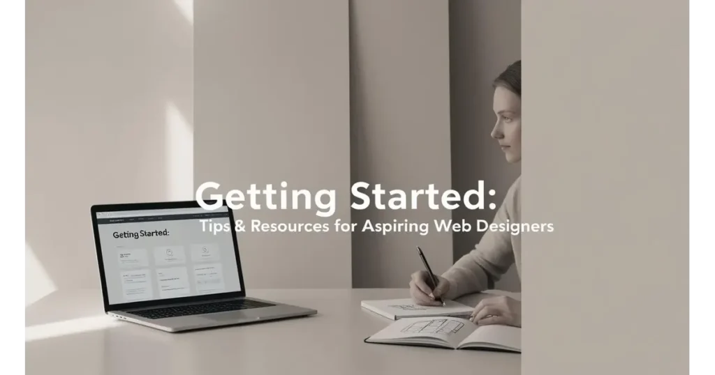
So, you’re ready to dive into the world of web design? Whether you’re a curious creative, a coding newbie, or a side-hustler looking to build your personal brand, getting started in web design doesn’t require a full-fledged degree or years of experience. It just needs the right tools, resources, and a sprinkle of that “I’ve-got-this” energy.
Here’s your personalized starter kit to ease you into the web design universe with clarity, creativity, and a touch of class.
Hands-on Tools to Get You Designing Like a Pro
Before you touch a line of code (or decide you never want to), here are a few tools to play with that make designing feel like second nature:
Figma
Your best friend in UI/UX design.
– Cloud-based, intuitive, and perfect for both solo creators and collaborative teams.
– From wireframes to prototypes, Figma lets you breathe life into your ideas in real-time.
Pro Tip: Start by recreating your favorite app’s interface—just to see how they do it.
CodePen
Where design meets code.
– It’s like a digital playground for front-end devs.
– HTML, CSS, and JS in one place; watch your changes happen live.
Use it when you’re experimenting with animations, hover effects, or trying to understand how CSS works like magic.
Webflow
Design. Animate. Launch.
– Webflow’s visual interface lets you build responsive websites—without writing code.
– Perfect for those who love design but want working results fast.
Great for freelancers and creatives who want full control—from layout to launch.
Learn on the Go: Online Courses & YouTube Goldmines
Let’s face it; YouTube and free online courses are today’s web design bootcamps.
- freeCodeCamp: Think of it as your structured, no-fluff university. Offers full certification paths on web design and responsive web development.
- DesignCourse (YouTube): Super fun visual tutorials with a focus on aesthetics, UX, and real-world use cases.
- Kevin Powell (YouTube): Want to fall in love with CSS? Kevin makes CSS concepts ridiculously easy and surprisingly enjoyable.
- Coursera / edX (Audit for free): Professional-level courses from top universities—without the price tag.
Try setting a goal: Complete one video tutorial per day and apply it to your mini-project.
Join the Tribe: Web Design Communities to Connect, Share & Grow
Learning doesn’t have to be a lonely road. The real growth happens when you’re surrounded by others on the same journey.
- Dribbble: A showcase of the best designs on the internet. Great for visual inspo and building your portfolio.
- Behance: Perfect for presenting full case studies. Show your process, not just the pixels.
- Reddit (r/web_design, r/Frontend): A goldmine of discussions, beginner questions, and brutally honest feedback.
- Discord Groups: Look for design/developer-focused servers to get feedback, build collabs, and stay updated on trends.
Not ready to post your work? Lurk. Learn. Then launch.
Starter Projects to Build Your Skills & Confidence
Learning theory is great, but your real teacher? Practice.
Here are a few beginner-friendly project ideas that are both fun and functional:
- Redesign Your Favorite Website Homepage
Pick a site you love (or hate) and reimagine it. Think UX, layout, typography, colors. What would you do differently? - Create Your Personal Portfolio Website
Tell the world who you are. Start small. An “About Me” section, a few links to your work, and a contact form. It’s your digital home. - Build a Product Landing Page
Choose a fictional product (coffee beans, unicorn plushies, a new SaaS tool) and design a conversion-focused layout. - Make a Blog Template
Learn layout logic, spacing, typography hierarchy, and responsive design in one go.
Keep it light, keep it consistent, and don’t aim for perfect; aim for progress.
Web design isn’t about mastering everything overnight. It’s about layering skills like building blocks; design sensibility, a bit of code, user empathy, and a whole lot of curiosity.
So pick a tool, join a community, and start designing messy. You’ll refine it with time. The web’s waiting for your magic; pixel by pixel.
FAQs
What is an accessible website?
It’s a site that’s usable by everyone, including people with disabilities. It includes alt text, contrast, keyboard navigation, and screen reader compatibility.
Which framework should I learn first? Bootstrap or Tailwind CSS?
Bootstrap for beginners, Tailwind for more customization.
How does color psychology impact web design?
Colors influence perception. Blue evokes trust, red creates urgency, and green symbolizes growth. Choosing the right palette can enhance branding, guide emotion, and drive action.
Will voice interfaces replace traditional web design?
Not entirely, but they will supplement it. Voice UIs improve accessibility and are becoming common in e-commerce, smart homes, and searches.
Are web designers and graphic designers the same?
No. Web designers focus on interactive, screen-based experiences. Graphic designers work more with print and static visuals.
Conclusion
Web design is more than just pixels and code; it’s the art of building experiences that inform, inspire, and invite action. Whether you’re laying the first bricks of your digital foundation or polishing an existing site, understanding the principles, tools, and trends can help you craft websites that stand out and truly serve your users.
From embracing clean design and responsive layouts to exploring futuristic trends like AI tools and AR/VR interactions, the world of web design is constantly evolving—and full of possibilities. Whether you’re a curious beginner or a seasoned creative, there’s always something new to explore, test, and master.
Ready to elevate your digital presence?
Discover our Web Design & Branding Services or explore our Custom Web Development Solutions and let’s make your website extraordinary.


