Introduction
In the world of web design, first impressions are everything and often, they start with the choices of color and typography. Picture stepping into a room painted in soothing blues, where every detail, from the furniture to the lighting, is designed to evoke a specific mood. This is the power of visual design, and the same principle applies to websites. Typography in websites is more than just selecting fonts; it’s about using font styles and sizes to guide the user’s emotions, readability, and overall experience. When paired with a thoughtfully chosen color palette, typography can enhance usability and create an instant connection with visitors.
In this guide, we’ll dive deep into the relationship between color psychology and typographic hierarchy, exploring how these two elements work together to craft a memorable website. You’ll learn how to strategically pair fonts and colors, understand the emotional impact of design choices, and explore real-world examples that demonstrate these concepts in action. Whether you’re looking to refine your website’s aesthetic or improve user experience, mastering typography and color will help elevate your design to new heights. Keep reading to discover how these powerful tools can transform your site into an engaging, functional masterpiece.
Key Takeaways
- First Impressions Matter: Color and typography are key to making a positive first impression in web design. The right combination sets the tone and guides user perception.
- Color Theory is Essential: Understanding the color wheel and color psychology helps create emotional connections and drive action on your website.
- Typography Shapes Usability: Choosing the right fonts and maintaining proper typographic hierarchy improves readability and user experience.
- Contrast Enhances Clarity: A strong contrast between text and background, like black-on-white, enhances legibility and ensures users can easily navigate your content.
- Keep it Simple: For the best user experience, limit the number of fonts on a website and choose high-contrast, readable combinations.
- Brand Identity Through Consistency: Consistent use of color and typography reinforces your brand’s identity and strengthens recall across your site.
- Follow Accessibility Guidelines: Ensure that your design meets accessibility standards, like contrast ratios, for a more inclusive user experience.
- Leverage Future Trends: Stay ahead by experimenting with variable fonts, dark mode, gradients, and AI-powered design tools for a modern, responsive design.
- Harmonize for Impact: Color and typography should work together seamlessly to create a visually appealing and emotionally engaging website.
Table of Contents
The Art and Science of Color Theory in Web Design: Elevating Typography through Color

Color isn’t just decoration; It’s a silent storyteller. When paired with typography in websites, it shapes how users feel, navigate, and connect with your brand. Just like a painter chooses colors with purpose, web designers use color theory to create balance, emotion, and clarity. Whether you’re building a bold landing page or a calm portfolio, mastering the harmony between color and type can turn a simple site into an unforgettable experience.
Color Wheel Basics: The Foundation of Color Choices
The color wheel is the cornerstone of color theory. It’s a visual tool that organizes colors in a circular format, creating a guide for understanding how colors interact with each other. At its core, the wheel consists of primary, secondary, and tertiary colors:
- Primary Colors: Red, blue, and yellow – these are the building blocks of all other colors. They cannot be created by mixing other hues and form the basis for designing color schemes.
- Secondary Colors: Orange, green, and purple – these are created by mixing two primary colors. Secondary colors help add vibrancy and contrast to your design.
- Tertiary Colors: These colors are created by mixing a primary color with a secondary color, like yellow-orange or red-purple, offering more options for subtle variety and complexity in your design.
When applying typography in websites, choosing colors from the wheel is essential to achieving the desired visual harmony and balance. A well-understood color wheel empowers designers to make intentional choices that elevate the message and aesthetics of their site.
Color Schemes: Crafting the Perfect Visual Balance
Color schemes are the relationships between colors on the color wheel. These carefully chosen color combinations help create unity and contrast in web design, guiding the viewer’s eye and enhancing user experience. Here are the main types of color schemes:
- Complementary Colors: These colors are directly opposite each other on the color wheel, such as red and green or blue and orange. Complementary color schemes are high-contrast, making them perfect for drawing attention to specific elements like call-to-action buttons. When paired with readable typography, complementary colors ensure that your message stands out.
- Analogous Colors: Analogous colors sit next to each other on the color wheel, such as blue, green, and teal. This scheme creates a serene and harmonious look, ideal for sites focused on calm, soothing experiences. When paired with subtle typography, analogous colors create a seamless flow that guides users without overwhelming them.
- Triadic Colors: A triadic scheme uses three evenly spaced colors on the color wheel. Think of a primary triad: red, blue, and yellow. Triadic schemes offer balance and diversity, often used in playful, dynamic designs. Typography in websites using triadic colors can stand out with contrasting text, ensuring readability without sacrificing visual appeal.
- Monochromatic Colors: This scheme uses variations of a single color, from light to dark tones. It creates a clean and sophisticated look, perfect for minimalist designs. Paired with elegant typography, a monochromatic scheme exudes professionalism and simplicity, enhancing user experience with clarity and focus.
Color Psychology: Evoking Emotion and Driving Action
Color has a profound impact on human emotions and behavior. In web design, it’s not just about making things look pretty, it’s about choosing colors that evoke the right feelings and guide user actions. Color psychology helps designers connect with their audience on a deeper level:
- Red: Often associated with urgency, passion, and energy. Red is commonly used in sales or countdown timers to prompt immediate action. When paired with bold typography, red can drive users to act quickly, creating a sense of excitement.
- Blue: A color of trust, professionalism, and calm. Blue is widely used in corporate websites, financial institutions, and tech platforms to build credibility. Typography in websites with blue tones exudes a sense of reliability and peace, making it easier for users to trust the content.
- Yellow: A color that evokes optimism and attention. Yellow is great for drawing attention to important elements without overwhelming the senses. When used with easy-to-read typography, yellow enhances visibility, making critical information stand out.
- Green: Symbolizes growth, tranquility, and health. Green is ideal for environmental websites, health services, and wellness brands. It pairs beautifully with soft typography, creating a natural and calming atmosphere.
- Purple: Represents creativity, luxury, and sophistication. Purple is perfect for luxury brands and creative businesses. When combined with elegant typography, it can give your site an air of prestige and uniqueness.
By leveraging color psychology, typography in websites becomes more than just readable text, it becomes a tool for emotional connection and user motivation.
Cultural Relevance: Understanding the Global Impact of Color
Colors are not universally interpreted the same way across cultures. What works in one country might not resonate in another, so understanding the cultural context of color is essential for global web design:
- White: In Western cultures, white symbolizes purity and peace. However, in many Asian cultures, it represents mourning and loss. When designing for diverse global audiences, ensure that the use of white doesn’t inadvertently carry negative connotations.
- Red: While red in Western cultures can symbolize danger or passion, in China, it’s a color of luck and celebration. For websites targeting international audiences, it’s crucial to consider the cultural implications of red, as it could either be a call to action or a cultural faux pas.
- Yellow: In the West, yellow often symbolizes happiness and warmth. Yet in some Middle Eastern cultures, it can be seen as a color of caution. Understanding these nuances helps in choosing the right colors to create a positive impact across different regions.
- Black: In the West, black is often associated with sophistication, but in many cultures, it represents mourning and death. Ensure that your typography in websites takes this into account, as black could have different meanings in various cultural contexts.
When designing for a global audience, cultural relevance in color choices ensures that your typography in websites resonates with users from diverse backgrounds, creating a universal appeal without alienating any group.
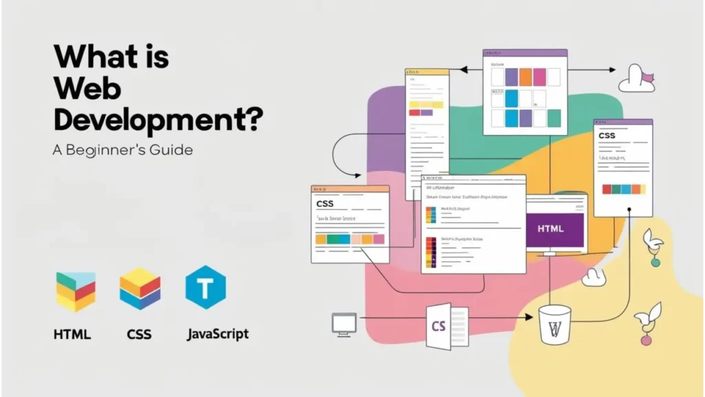
Typography in Websites: A Foundation for Effective Design
Typography in websites is more than just choosing fonts; it’s about shaping how users interact with your content. It plays a key role in guiding visitors through your site, making it essential for readability, hierarchy, and engagement. Let’s break down the essentials of typography to help you create a visually appealing and user-friendly web design.
Font Types: Choosing the Right Style
Selecting the right font is crucial for setting the tone of your website. Here’s a breakdown of common font types:
- Serif Fonts: These fonts, like Times New Roman, convey tradition and elegance, often used for formal or print-like designs.
- Sans-Serif Fonts: Fonts such as Arial and Helvetica are modern and easy to read on screens, making them ideal for clean, minimal websites.
- Script Fonts: Mimicking handwriting, these fonts add a personal touch but are best for titles, not body text.
- Display Fonts: Bold and eye-catching, display fonts are perfect for headlines, adding character to your design.
Choosing the right font ensures your message comes across clearly and appropriately.
Font Attributes: Details Matter
Font attributes like weight, size, and spacing impact the readability and aesthetics of your website:
- Weight: Bold or light weights help emphasize important text.
- Size: Use larger sizes for headings and smaller sizes for body text to create a visual hierarchy.
- Tracking & Kerning: Adjusting the spacing between letters and words ensures readability and balance.
- Line Height: Proper spacing between lines of text makes content easy to read and digest.
These attributes enhance typography and create a smooth, readable experience.
Typographic Hierarchy: Organizing Content
A clear typographic hierarchy guides users through your website content:
- Headings: Larger, bold fonts to catch attention and define sections.
- Subheadings: Slightly smaller but still prominent, breaking up content into digestible chunks.
- Body Text: Clear, legible fonts that are easy to read.
- Captions: Small but readable text that complements images or additional information.
A structured hierarchy ensures users can easily scan and understand your site’s content.
Web-Safe Fonts and Accessibility: Inclusivity Matters
Using web-safe fonts ensures that your typography is consistent across devices:
- Web-Safe Fonts: These fonts, like Arial or Times New Roman, display properly on most browsers and devices.
- Accessibility: Choose legible fonts with high contrast for users with visual impairments, and provide options to adjust text size.
By focusing on these factors, your typography will be accessible to all users, enhancing the overall experience.
Your design is only as strong as your message.
Need help blending type and color for powerful branding?
Explore our Web Design & Branding Services & Get Custom Web Development Solutions
Let’s build a website that speaks volumes without saying a word.
How Color and Typography Work Together: The Power Duo of Web Design
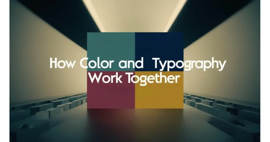
In the world of web design, color and typography are not just two separate elements; they are partners in creating a memorable, engaging, and user-friendly experience. Together, they work like a symphony, guiding the user’s eye, setting the emotional tone, and delivering your message with impact. When combined thoughtfully, color and typography can elevate your website’s readability, influence perception, and drive action. Let’s explore how these two elements complement each other to craft a seamless, visually appealing design that not only looks good but works effectively.
Contrast for Clarity: Why Black-on-White Still Wins for Readability
When it comes to typography in websites, contrast is crucial for readability. Black text on a white background remains one of the most effective and timeless color pairings for ensuring clarity. This stark contrast creates a sharp distinction between text and background, allowing the eyes to focus without strain. For users, this means they can consume content effortlessly, especially for longer text like blogs, articles, or product descriptions. The simple combination of black and white is easy on the eyes and universally accessible, making it a tried-and-true choice for website typography.
However, while black-on-white remains a classic, designers have more freedom today to experiment with color contrasts. Dark backgrounds with lighter text, such as navy blue with white or dark gray with soft pastels, can offer a more modern and sleek appearance. But no matter how bold or subtle the color palette, the key to good typography in websites remains high contrast ensuring your text remains legible and your message clear.
Emotional Tone Setting: Pairing Fonts and Colors to Influence User Perception
Color and typography in websites are powerful tools for setting the emotional tone of your website. Just as color can evoke specific emotions; Red for urgency, blue for trust, yellow for optimism. Fonts can influence the mood as well. Serif fonts often give off a traditional, formal vibe, while sans-serif fonts offer a more clean, modern look. Together, these elements can work harmoniously to reinforce the feelings you want to evoke in your audience. For instance, using a bold sans-serif font paired with a vibrant color like orange can create a feeling of excitement, making it perfect for sales pages or event promotions.
On the flip side, pairing a soft script font with calming colors like light blues or greens can evoke relaxation and trust, which is why these combinations are often used for wellness or healthcare websites. The emotional tone you set through the combination of typography and color influences how users feel when interacting with your site, which can ultimately impact their behavior and decision-making process.
Brand Identity: How Consistent Type and Palette Strengthen Brand Recall
Typography and color are essential in establishing a strong and consistent brand identity. When paired effectively, these elements form a cohesive visual language that helps users instantly recognize your brand. Think of Coca-Cola’s iconic red color and distinct script font; these elements are so ingrained in the brand’s identity that they evoke a sense of familiarity and trust, often at first glance. Consistent website typography combined with a carefully chosen color palette reinforces this idea of brand recognition. When your typography and color palette align across all your web pages and marketing materials, it strengthens your brand’s identity and recall.
A well-chosen color palette and typography style become part of your brand’s signature, differentiating you from competitors and ensuring a memorable user experience. For instance, a tech brand might choose sleek, minimalist fonts in a blue-and-black color scheme to communicate professionalism and innovation, while a creative agency might choose playful, bold fonts with a mix of bright, energetic colors to reflect its dynamic personality. Consistency in these elements ensures that users not only remember your brand but feel connected to it as well.
Call-to-Action Optimization: Using Color and Font Treatment to Highlight CTAs
The effectiveness of your call-to-action (CTA) can be significantly enhanced through the strategic use of color and typography. When it comes to typography in websites, making your CTA buttons stand out is critical to driving conversions. The color of your CTA button should contrast with the rest of the page, grabbing attention without overwhelming the overall design. A bright color like red, green, or orange draws the eye naturally, signaling urgency or action. However, this color should be in harmony with the overall palette of your website to maintain balance and visual appeal.
In addition to color, typography plays a key role in CTA optimization. The font should be bold and legible, clearly distinguishing it from other elements on the page. Using a slightly larger font size or a weightier version of your site’s regular font can make your CTA text pop. Combining a striking color with strong typography ensures your call-to-action stands out, inviting users to take the next step whether it’s signing up for a newsletter, making a purchase, or downloading an app. This cohesive pairing of typography and color can greatly increase user interaction and conversion rates.
Practical Tips for Combining Typography and Color
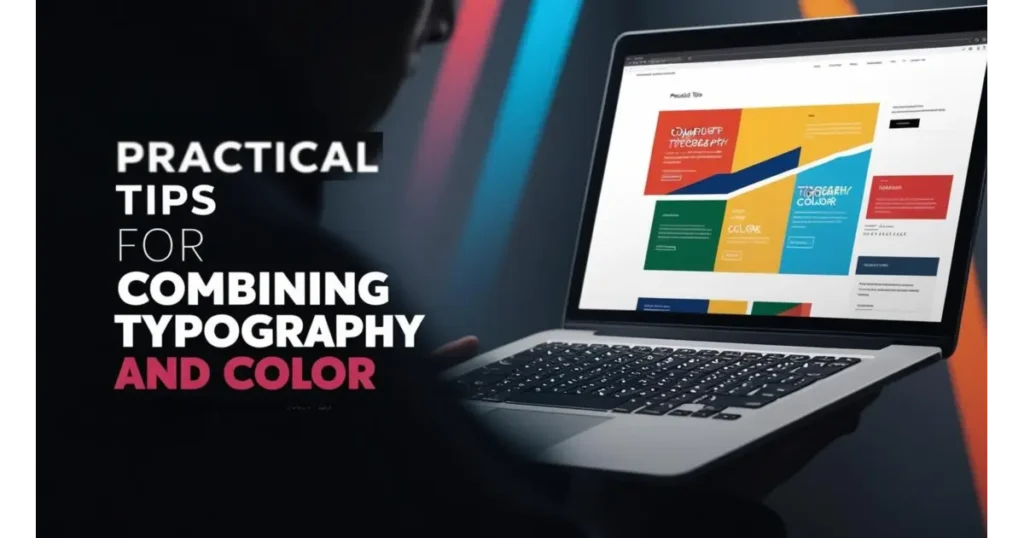
In the intricate dance of web design, typography and color must work hand in hand to create a seamless and engaging user experience. Just as a skilled conductor brings harmony to an orchestra, the right combination of fonts and colors can transform a website from ordinary to extraordinary. But, how do you strike the perfect balance between these two elements without overwhelming the user? The answer lies in understanding the subtle yet powerful impact they have on readability, accessibility, and overall aesthetic appeal. Let’s explore some practical tips that will help you combine typography and color in a way that not only looks stunning but also enhances user engagement.
Choose Readable Combinations: High Contrast + Simple Fonts = Win
When it comes to typography in websites, the magic lies in the delicate balance between contrast and simplicity. Imagine walking into a room where everything is lit up perfectly, easy to navigate, and free from distractions. That’s the feeling you want to create for your visitors. By opting for high contrast between your text and background, you make your content stand out clearly, ensuring readability. The classic example is black text on a white background, which has remained timeless for a reason. This simple yet powerful combination delivers readability at its best. The high contrast catches the eye instantly, and the white background provides the perfect canvas for the text.
But clarity isn’t enough on its own. Simplicity plays a huge role too. While contrast grabs attention, simple fonts ensure that your message is understood without unnecessary distractions. Choose clean, legible fonts that don’t overcomplicate the reading experience. Avoid excessive embellishments or overly decorative fonts, which can hinder the message. Simple fonts, when paired with high contrast, create a balanced design that guides users effortlessly through your site. In the end, this combination of contrast and simplicity is the foundation of great typography on websites, offering both style and functionality.
Follow the 60-30-10 Rule: Balance Primary, Secondary, and Accent Colors
Color is one of the most powerful tools in web design, and using it effectively can make all the difference. When applying color to your typography in websites, the 60-30-10 rule is a guide that brings harmony and balance to your design. Think of this rule as the choreography for your color palette. The primary color, which makes up 60% of your design, should be the dominant hue that gives your website its overall vibe. It anchors your design, providing consistency and clarity throughout. The secondary color, covering 30%, serves to complement the primary, adding depth and interest without overshadowing it.
The remaining 10% is reserved for accent colors. This is where you add a touch of excitement using this color sparingly on calls to action (CTAs), links, or buttons that need attention. These pops of color help guide users through the page, emphasizing key areas and encouraging engagement. When used thoughtfully, accent colors can bring a website to life, making the content both dynamic and easy to navigate. The 60-30-10 rule helps keep your color choices purposeful and deliberate, ensuring that your typography and color work together cohesively to create a visually appealing and user-friendly website.
Avoid Font Clutter: Use a Max of 2–3 Fonts Per Site
Typography in websites is a balance of structure and creativity, but it’s easy to overcomplicate things with too many fonts. Imagine entering a room filled with loud, competing voices, it’s chaotic, right? The same holds true for websites with excessive fonts. Multiple fonts can create visual clutter, making it difficult for users to focus on the content. Instead of overwhelming visitors, the goal should be to guide them smoothly through your site. Limiting yourself to 2-3 fonts will help you create a cohesive design that enhances readability.
Start with one font for your headlines, something bold and attention-grabbing. For the body text, choose a simple, legible font that invites people to read. If needed, a third font can be used sparingly for captions, quotes, or special highlights. By restricting your fonts, you focus on what’s important; Clarity and Hierarchy. This creates a clean, professional look where each element has a defined role. Typography shouldn’t compete for attention; it should serve the content. With just 2-3 fonts, you’ll strike the perfect balance, ensuring that your website looks polished and easy to navigate.
Accessibility Best Practices: Meet WCAG Contrast Ratios and Text Clarity Standards
Accessibility is a vital aspect of typography in websites, ensuring that your content is readable by all users, including those with visual impairments. One key aspect of accessibility is meeting the WCAG contrast ratios, which are guidelines designed to ensure that text is legible for people with varying degrees of vision. A sufficient contrast ratio between text and its background ensures that your site remains accessible to users with low vision or color blindness. For example, using dark text on a light background provides clear visibility, while light text on a dark background can also be effective when done correctly.
However, accessibility goes beyond just color contrast. Typography also needs to be clear and legible for everyone. This includes choosing fonts that are easy to read, ensuring proper font sizing, and avoiding overly complex scripts that may be difficult for some users to decipher. By following these accessibility best practices, you create a website that caters to all users, regardless of their visual ability. A website that meets these standards doesn’t just look good, it’s functional for everyone, giving each visitor an inclusive experience. By embracing these guidelines, you elevate your website’s usability and demonstrate a commitment to thoughtful design.
Real-World Case Studies: Wodo Digital Projects
At Wodo, we don’t just build websites; we craft digital experiences that tell the story of each brand. Every visual element, from typography to layout, is thoughtfully curated to ensure that every interaction is seamless. Our design-first approach ensures the story of each business is woven into the fabric of their website, making every click a memorable one. From dynamic startups to established ventures, we focus on creating websites that are not only visually captivating but also strategically functional. Here’s how Wodo’s team brought thoughtful web design and development to life for brands like The Native Angadi, Digital Strawberry, Farmsource India, and Ayushyaa Clinic.
The Native Angadi
For The Native Angadi, our design approach was to blend tradition with modern functionality. We wanted the website to reflect the brand’s authenticity, and so we chose earthy tones and serif fonts that evoke a sense of heritage. The typography was key in conveying the artisanal, rooted appeal of the brand. We created an inviting online space where visitors immediately felt a connection to the brand’s story. The layout was designed for simplicity and ease of navigation, showcasing the rich history of the products, user reviews, and an engaging mini travel itinerary section for adventure lovers.
The result was a website that beautifully reflected the brand’s heritage while ensuring a smooth, intuitive experience for users.
Through a thoughtful combination of design elements, The Native Angadi’s website became an immersive digital experience. Every detail, from fonts to color palette, was carefully chosen to enhance the brand’s identity, fostering trust and encouraging higher engagement.
Success:
- Engaged users with an intuitive layout and smooth navigation
- Reflected the brand’s heritage while maintaining modern functionality
- Elevated user trust and retention through compelling design
Digital Strawberry
For Digital Strawberry, the goal was to create a website that communicated the playful, creative spirit of the brand. With a bright and vibrant color palette paired with rounded sans-serif fonts, we set the tone for a dynamic and engaging experience. The typography’s rounded shapes mirrored the website’s soft, welcoming design, creating a playful yet professional atmosphere. We wanted the design to be intuitive, allowing users to easily navigate through an engaging digital space that reflected the agency’s innovation and creativity.
The final result was an award-winning website that captivated users with its retro gaming elements and animated graphics. This fun and nostalgic approach allowed Digital Strawberry to make a bold statement while showcasing their creative prowess. The website became more than just a digital space. It was an extension of their brand’s unique identity.
Success:
- Created an engaging and interactive design with playful retro elements
- Awarded “Best Site of October 2021” by Elementor
- Captured the agency’s creativity through dynamic visuals and design
Farmsource India
For Farmsource India, we focused on a clean, crisp design that reflected the brand’s commitment to health and sustainability. The fresh green color palette not only conveyed the company’s values but also created a calming and approachable user experience. To complement this, we used clean, modern fonts to ensure that the website was easy to read and navigate. The design made it easy for users to quickly access the information they needed about the brand’s products and services, without unnecessary distractions.
The result was a website that felt fresh, approachable, and trustworthy. The simple, intuitive design allowed users to connect with the brand’s mission while keeping the website user-friendly and efficient. Through this design, Farmsource India was able to effectively communicate its dedication to sustainability and build stronger engagement with its audience.
Success:
- Created a simple, intuitive website that communicated the brand’s values
- Built trust among users with a fresh, approachable design
- Improved user engagement by providing clear and concise information
Ayushyaa Clinic
For Ayushyaa Clinic, the goal was to revamp the existing website to create a modern, streamlined user experience. We incorporated cool blues in the color scheme, paired with minimalistic, modern typefaces, to evoke professionalism and trust; key aspects of any healthcare brand. The design was carefully crafted to ensure that the website was both calming and functional, offering users a seamless experience when accessing important healthcare information.
The redesigned website not only improved the overall user experience but also reinforced the clinic’s reputation as a credible healthcare provider. With its user-friendly interface, the site helped patients feel confident in the clinic’s services while providing them with a smooth and serene online journey.
Success:
- Created a calming, professional digital presence for the clinic
- Enhanced user engagement by providing easy access to healthcare information
- Improved overall site performance and user satisfaction
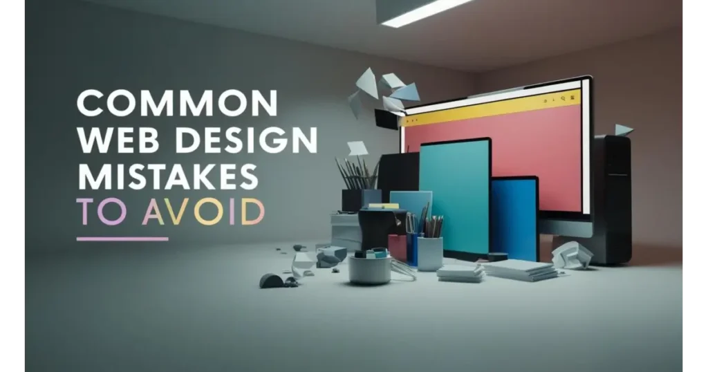
Common Web Design Mistakes to Avoid
Design isn’t just about beauty; It’s about building trust. A beautifully designed website that fails to function properly is one of the most common web design mistakes businesses make. In the digital world, first impressions are formed in milliseconds, and small design flaws can quietly cost you big, whether it’s users bouncing off your page or search engines pushing you down the ranks. From unreadable fonts to inaccessible layouts, the most overlooked issues in web design often have the biggest impact on usability, performance, and SEO.
That’s why effective web design is a balance between creativity and functionality. A strategic design approach ensures that your website isn’t just visually appealing, but also responsive, accessible, and brand-aligned. Let’s dive into the most common website design mistakes and how to fix them before they trip up your digital success.
1. Poor Contrast Between Text and Background
When your website’s text melts into the background, it becomes a frustrating guessing game for users. Poor contrast in web design not only impacts readability but also makes your site feel amateurish. Whether it’s light gray text on white or neon on black, low contrast combinations reduce accessibility, especially for users with visual impairments. It’s a subtle mistake, but it can massively damage both your user engagement and your SEO efforts. A website should be effortlessly legible not something your visitors have to squint at or zoom into. Your message deserves to be seen and understood.
Why it matters:
Bad contrast reduces readability and weakens your website’s accessibility and UX.
What to do instead:
Use high-contrast color pairings and always test legibility across screens using a contrast checker tool.
2. Overuse of Decorative Fonts
Decorative fonts can be charming until they overwhelm your content. When every heading screams in cursive or every paragraph dances in quirky scripts, users are more likely to click away than stay engaged. This is one of the most common typography mistakes in web design, where brands try to express personality but sacrifice clarity. While fonts can reflect tone and branding, going overboard leads to a cluttered, inconsistent experience. Remember, web fonts need to scale across devices and browsers. Simplicity in typography doesn’t mean boring. It means readable, reliable, and refined.
Why it matters:
Fancy fonts slow reading and reduce clarity, hurting user experience and SEO.
What to do instead:
Use decorative fonts sparingly, mainly for headings and stick to clean, web-safe fonts for content.
3. Ignoring Accessibility Requirements
Neglecting accessible web design is not just a design flaw. It’s a missed opportunity to connect with a wider audience. Accessibility means designing for everyone, including users with disabilities. Whether it’s tiny fonts, non-responsive layouts, or color choices that exclude colorblind users, ignoring accessibility limits your website’s reach and SEO potential. It’s not only about ethics; it’s also about performance. Search engines favor websites that are easy to navigate, readable by screen readers, and offer a seamless experience to all. Accessibility is the future of smart, inclusive design.
Why it matters:
Ignoring accessibility hurts both user experience and your site’s SEO ranking.
What to do instead:
Use alt tags, readable font sizes, color-friendly palettes, and ensure your site is keyboard and screen-reader friendly.
4. Inconsistent Brand Application Across Pages
Your website is your digital storefront, and every page should feel like it belongs to the same brand family. Yet, one of the most common web design mistakes is inconsistency in branding. Changing fonts, mismatched colors, uneven layout structures, or shifts in tone can confuse visitors and reduce brand trust. Inconsistent branding dilutes your identity and makes your business look less professional. Users should feel a sense of coherence across every click, scroll, and interaction. Whether they’re on your homepage or reading a blog, the experience should feel unified and unmistakably you.
Why it matters:
Inconsistency weakens your brand identity and disrupts user trust.
What to do instead:
Stick to a clear brand style guide. Use consistent colors, typography, imagery, and tone across every page.
Future Trends in Web Typography and Color
The visual voice of a website is evolving. Typography and color are no longer just design choices, they’re storytellers, mood-setters, and accessibility champions. As the digital world becomes more interactive, adaptive, and personalized, designers are now turning to smarter, bolder, and more flexible solutions to captivate users. From fonts that morph with screen sizes to AI tools that suggest the perfect color palette, web design is embracing innovation with open arms and wide eyes.
In the coming years, we’ll see typography and color stepping into more powerful roles. Think dynamic fonts that respond in real time, color gradients that breathe life into headers, and AI tools that curate entire visual identities. It’s a world where design gets smarter, more inclusive, and emotionally resonant. Here’s a peek into the typography and color trends set to define the future of web design.
1. Variable Fonts: Dynamic Typography for Flexible Responsiveness
Remember the days when choosing a bold or italic version of a font felt like a big decision? Fast forward to now, and we’re entering a world where a single font file can transform its shape, weight, and style, all based on the screen it’s being viewed on. Enter variable fonts. These dynamic typefaces are designed to adapt fluidly, offering endless variations in thickness, width, and slant without needing multiple font files. That means faster loading, cleaner design systems, and a more responsive experience across devices.
Variable fonts are more than a performance upgrade, they’re storytellers. Imagine a headline that becomes bolder as the user scrolls down or a product description that subtly shifts weight to draw attention to new arrivals. With just one font file, designers can craft typography that reacts, engages, and performs. It’s like giving your words the power to move and breathe with your users.
2. Dark Mode Design: Font Color Challenges and Solutions
Dark mode is no longer a niche setting, it’s a full-blown design expectation. Users love it for its aesthetic, reduced eye strain, and battery-saving benefits. But designing for dark mode isn’t just about flipping a background to black. It brings unique challenges in typography and color contrast. Fonts that looked sleek on a white background might vanish into the shadows. Colors lose vibrancy, and legibility can plummet if designers aren’t careful.
To master dark mode, web typography must be rethought carefully choosing font weights, glow effects, and color pairings that maintain readability without overwhelming the eyes. It’s about striking a balance between style and function. Designers are leaning into softer whites, rich accent colors, and thoughtful spacing to make sure content stands out while still feeling easy on the eyes. The goal? Create a moodier, immersive experience without compromising clarity.
3. Gradient and Multicolor Text: Used Wisely for Headers and Branding
Flat colors are making way for a new visual renaissance; gradient and multicolor typography. Once considered a design faux pas, this trend is now reemerging with sophistication and purpose. Used mostly in hero sections, logos, or header text, gradients bring depth and drama to typography, giving brands a chance to express emotion and energy in just a few words. It’s not about going rainbow crazy; it’s about thoughtful application and digital storytelling.
When done right, multicolor text can be a brand’s secret weapon. A soft transition from coral to crimson in a headline can signal warmth and creativity. A bold neon blend can evoke techy vibes or futuristic flair. Designers are even animating these gradients to create scroll-triggered color shifts, turning static type into living art. The key lies in moderation, used strategically, gradient typography can grab attention without overwhelming the message.
4. AI Tools: Smart Font and Color Pairing Using AI-Based Platforms
In a world where design deadlines are tighter and expectations higher, AI has arrived like a digital design assistant that never sleeps. From suggesting font pairings based on your brand tone to generating harmonious color palettes in seconds, AI in web design is changing how we approach creativity. Designers no longer need to scroll endlessly through type foundries or color wheels. AI tools analyze psychology, accessibility, and aesthetics to offer suggestions that actually work.
Think of it as having a creative partner who knows trends, reads analytics, and never runs out of ideas. Platforms like Adobe Firefly, Khroma, and Colormind are already using machine learning to craft personalized design suggestions. Whether you’re designing a modern fintech site or a whimsical children’s blog, AI tools can now predict the best combinations to deliver both beauty and function. It’s not replacing human creativity, it’s elevating it.
FAQs
What are the best font pairings for websites?
Clean combinations like serif headers with sans-serif body text work well. For example, Playfair Display + Lato is elegant and readable.
How many colors should a website use?
Stick to a primary palette of 3–5 colors for a clean, consistent design. Accent colors can add energy if used wisely.
Can typography influence user behavior?
Absolutely. Typography affects how users read, interpret, and feel about your content. A clean sans-serif may feel modern and friendly, while a serif font adds credibility and tradition. When paired with the right color palette, it can nudge users toward taking action. Be it reading more, clicking a button, or making a purchase.
How does cultural context affect color usage in web design?
Colors have different meanings across cultures. For example, white symbolizes purity in the West but mourning in some Eastern cultures. A brand expanding globally must research color perception to avoid alienating users. Culturally conscious color use in typography and visuals builds emotional trust and cultural relevance.
Is dark mode typography different from light mode?
Yes. In dark mode, lighter fonts on dark backgrounds must maintain high contrast without straining the eyes. Font thickness and spacing often need tweaking to preserve clarity.
Conclusion
Typography and color aren’t just design elements; They’re the emotional heartbeat of your website. When used thoughtfully, they guide users, evoke emotion, and build trust at first glance. But great design isn’t about flashy fonts or trendy palettes alone. It’s about clarity, accessibility, and connection. Harmonizing typography and color ensures your message is not only seen but felt.
As web design continues to evolve, the best designers aren’t afraid to experiment. They play with gradients, embrace dark mode, and even explore AI-driven creativity. But at the core, they always stay grounded in UX principles because good design doesn’t just look good, it works beautifully.
Want to design a website that connects emotionally and converts effortlessly?
Let Wodo Digital help you:
Design bold, beautiful brand experiences & Develop high-performance websites with precision
Whether you’re building a brand from scratch or reinventing your digital identity, Wodo’s expert team knows how to bring your story to life—pixel by pixel, word by word. Let’s create something unforgettable.