
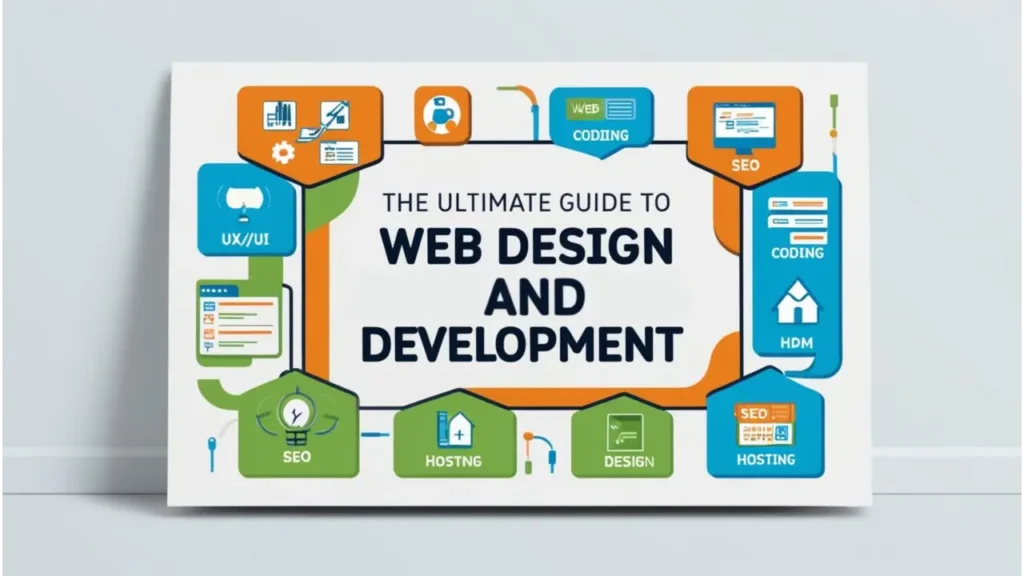
Introduction
Web design principles are the foundational guidelines that shape how websites look, feel, and function. In today’s fast-paced digital world, where users decide within seconds whether to stay on a site or bounce, applying the right design principles is crucial. These principles ensure that websites are not only visually appealing but also user-friendly, accessible, and conversion-focused.
A well-designed website directly impacts usability, helping users navigate effortlessly and find what they need. It enhances conversions by guiding users toward key actions like signing up, purchasing, or contacting. Moreover, consistent and thoughtful design reinforces a brand’s identity, creating a memorable digital experience that builds trust and recognition.
In this article, we’ll explore the core web design principles that every designer should know. From visual hierarchy and balance to mobile responsiveness and accessibility. We’ll also dive into real-world case studies that demonstrate these principles in action and feature expert insights from industry professionals. Whether you’re a beginner or a seasoned designer, this guide will help you create websites that are not only beautiful but also effective.
Key Takeaways
- User Behavior Understanding: Recognizing how users scan websites, like following F-patterns, is essential for crafting intuitive designs that meet their expectations and improve usability.
- Visual Hierarchy & Consistency: A strong visual hierarchy ensures important elements stand out, guiding users naturally through your content. Consistency in design, from fonts to colors, builds trust and reinforces your brand identity.
- Simplicity is Key: Minimalist designs that avoid clutter improve user engagement and performance. By keeping elements clean and focused, you make it easier for users to navigate and interact.
- Mobile Responsiveness: In today’s mobile-first world, ensuring that your website adapts seamlessly to different screen sizes is crucial for reaching all users. A responsive, touch-friendly interface is a must-have.
- Fast Load Times & Optimization: Slow loading times can frustrate users and hurt SEO. Optimizing images, using clean code, and employing techniques like lazy loading help ensure your site performs well across devices.
- Accessibility for All Users: Designing with accessibility in mind, such as using high contrast, alt text, and following WCAG guidelines, ensures your website is usable by people with disabilities, broadening your audience reach.
- Efficient Navigation: Simplifying your website’s navigation reduces friction and leads to a better user experience. Clear menus, breadcrumbs, and an intuitive layout will help guide visitors effortlessly.
Table of Contents
Understanding User Behavior
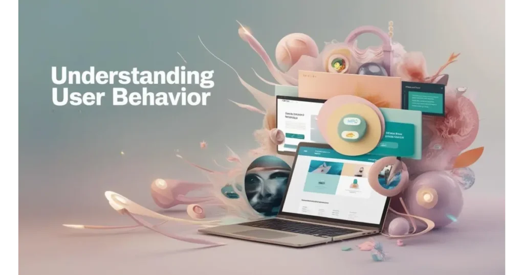
Design isn’t just what you see; It’s how it makes users feel and behave. The most effective websites are built on the understanding that people don’t experience the web passively. They interact, skim, click, and bounce. That’s why successful web design principles begin with studying user behavior. Knowing how users scan content, what they expect to find, and how they emotionally engage with a website allows designers to create intuitive, frictionless experiences.
Understanding your audience is like having a conversation without words. Every button placement, text block, and image alignment becomes part of the dialogue. And when done right, it feels natural like the website knows what the user wants even before they do.
How Users Scan Websites?
When users land on a webpage, they don’t read it word for word; They scan it. Eye-tracking research shows two common patterns: the F-pattern and the Z-pattern.
F-pattern: Best suited for content-rich pages like blogs and news sites. Users scan across the top line, then down the left side, occasionally moving right—forming an “F” shape. Place headlines, hooks, and CTAs on the left for maximum visibility.
Z-pattern: Ideal for simpler, goal-oriented pages like landing pages. Users move in a “Z” shape, left to right at the top, diagonally down, and left to right again. Align your logo, message, and CTA along this path to guide attention smoothly.
Meeting User Expectations: Keep It Seamless
Web users come armed with mental models. They expect the logo to link to the homepage, the navigation bar to be on top, and the checkout button to be obvious. When your site meets these expectations, users feel in control. When it doesn’t, they get frustrated and leave. Great web design principles respect user habits while subtly enhancing them with thoughtful touches that elevate the experience.
Consistency is key. A predictable, polished interface builds trust and keeps the user journey smooth. The fewer surprises, the easier it is for users to focus on what matters.
Designing with Empathy and Intent
Designing with empathy is about seeing your site through your users’ eyes. What are their goals? What might confuse them? What do they feel when navigating your site? Empathy-driven design is one of the most underrated yet powerful web design principles; It brings humanity into technology. It means prioritizing accessibility, using inclusive language, and creating experiences that feel genuinely helpful.
Every design choice should be intentional. From color schemes to micro-interactions, when you pair empathy with purpose, you don’t just make a website; You craft a meaningful experience.
Core Principles of Effective Web Design
Behind every seamless digital experience is a foundation of smart, intentional design and strategic moves rooted in core web design principles. From the layout of elements to consistent branding across screens, these principles shape how users interact with and perceive your site. They ensure your website isn’t just visually appealing but also functional, user-friendly, and accessible. Whether it’s a portfolio, landing page, or e-commerce store, applying these fundamentals helps create clarity, boost usability, and leave a strong, lasting impression that keeps visitors coming back.
Visual Hierarchy
Great web design isn’t just about looking good; It’s about guiding the user’s eye where it matters most. Visual hierarchy is one of the most important web design principles, helping users navigate a page without even realizing it. By using size, contrast, alignment, and positioning strategically, you can highlight key content, such as headlines, calls-to-action, or product features, while keeping supporting information in the background. This not only makes the site visually engaging but also improves user flow and comprehension.
A strong visual hierarchy ensures that users instantly know what to look at first, second, and so on. It reduces the cognitive effort needed to understand your page, making the experience more intuitive and enjoyable. Whether you’re guiding users to sign up, explore a gallery, or click “Buy Now,” your design should naturally lead them there step by step, layer by layer.
Consistency
Consistency is the glue that holds a website together. It’s one of those subtle but powerful web design principles that builds user trust without them even noticing. When your fonts, colors, button styles, and layout patterns are uniform across pages, it creates a sense of familiarity that makes navigation feel natural. Visitors don’t have to relearn how your website works every time they move to a new page because everything behaves the same way.
Consistency also reinforces your brand identity. Whether someone visits your homepage or lands on a blog post, a consistent visual and interactive experience makes your site feel cohesive and credible. Over time, these consistent elements become recognizable markers of your brand, boosting retention and long-term user loyalty.
Simplicity
In the world of web design, less truly is more. Simplicity stands out as one of the core web design principles because users crave clarity, not clutter. A clean, focused layout lets your content shine, helping users find what they’re looking for faster. By removing unnecessary design elements, you reduce distractions and allow your website’s purpose to come through loud and clear. White space, concise text, and intuitive visuals all contribute to a simpler, smarter user experience.
Complex interfaces can be overwhelming, especially for new users. Simplifying design choices, from the number of buttons to the use of color makes your site feel more approachable and easier to use. It not only increases engagement but also reduces bounce rates and boosts conversions by keeping users focused on what really matters.
Accessibility
Designing with accessibility in mind isn’t just a best practice; It’s a responsibility. One of the most inclusive web design principles, accessibility ensures your site can be used by everyone, including people with visual, auditory, cognitive, or motor impairments. From using alt text for images and maintaining high color contrast to supporting keyboard navigation and screen readers, accessible design removes barriers and invites everyone in.
Following accessibility guidelines like WCAG doesn’t just serve a moral purpose; It also improves SEO, widens your audience, and increases overall usability for all users. When your site is accessible, it tells users, “You matter,” and that kind of care builds loyalty. A well-designed website should welcome everyone, regardless of ability or device.
Mobile Responsiveness
We live in a mobile-first world, and your website needs to reflect that reality. Mobile responsiveness is no longer optional, it’s one of the most critical web design principles today. With more than half of web traffic coming from smartphones, your design must adapt smoothly to smaller screens. This includes fluid layouts, scalable images, flexible text, and touch-friendly interfaces that make mobile browsing effortless.
A responsive site doesn’t just adjust in size; It adjusts in experience. Mobile users need quick access, easy scrolling, and tap-ready buttons. A mobile-first approach also ensures your desktop experience benefits from clarity and simplicity. Plus, Google prioritizes mobile-optimized websites in its rankings, making responsiveness key to both user experience and SEO performance.
Navigation
Imagine walking into a store where nothing is labeled and aisles lead nowhere. That’s what poor website navigation feels like. Clear, intuitive navigation is a cornerstone of web design principles, helping users move through your site without frustration. Whether it’s a well-placed menu, a breadcrumb trail, or a thoughtfully structured footer, good navigation helps users find what they need fast.
Designing smooth navigation means balancing simplicity with structure. Group related content, use recognizable icons, and keep menus uncluttered. A user who can explore your site confidently is far more likely to stay longer, engage more, and return often. Great navigation isn’t just helpful, It’s what keeps your site usable.
Load Time Optimization
No one likes waiting, especially online. In fact, even a one-second delay in page load time can dramatically increase bounce rates. That’s why optimizing for speed is one of the most performance-driven web design principles. Techniques like image compression, minified CSS and JavaScript, browser caching, and lazy loading ensure that your site loads swiftly, even on slower connections.
Fast load times not only improve user experience but also boost your search engine rankings. Search engines prioritize speed, and so do users. A website that loads in a flash keeps visitors engaged, increases conversions, and sends a strong signal that your site is modern, efficient, and reliable.
Want your website to look stunning and convert users like magic?
Explore our Web Design & Branding Services or Custom Web Development Solutions
Let Wodo Digital help you build with purpose and precision!
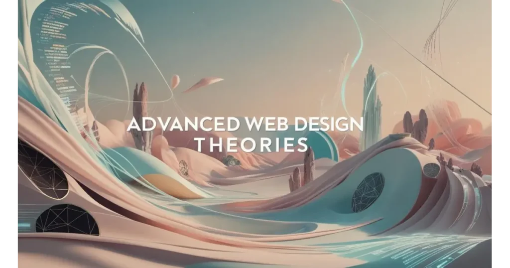
Advanced Web Design Theories
Hick’s Law
When it comes to web design, offering too many options can overwhelm users rather than empower them. Hick’s Law states that the more choices a user has, the longer they take to decide. It’s a psychological principle that directly impacts web usability. By limiting distractions and streamlining decision-making, you reduce friction and help users take action faster whether that’s clicking a CTA or navigating to a product page.
This theory is one of the more strategic web design principles because it teaches us the value of simplicity through choice. Want a higher conversion rate? Keep your menus minimal. Want better engagement? Prioritize your content. The fewer choices users have to make, the more confident and intuitive their journey becomes.
Fitts’s Law
Fitts’s Law says that the time to interact with a target (like a button) depends on its size and distance. Simply put: the bigger and closer something is, the easier it is to click. In web design, this means CTA buttons should be large, clearly visible, and placed where thumbs or cursors naturally go especially on mobile devices.
This principle isn’t just about aesthetics, it’s about speed and efficiency. One of the more technical web design principles, Fitts’s Law helps you craft a smoother user experience by making key interactions easier to reach. Want more clicks on your “Buy Now” button? Make it bold, big, and placed exactly where users expect to find it.
Gestalt Principles
Gestalt Principles explore how users visually interpret and group elements. These principles like proximity, similarity, and continuity allow designers to organize content in a way that feels natural and harmonious. When similar items are grouped close together, users instantly recognize patterns, making the interface easier to scan and understand.
These psychology-backed web design principles go beyond layout. They shape perception. For example:
- Proximity: Group related items to create order.
- Similarity: Use consistent styling to connect similar functions.
- Continuity: Lead the eye with lines and flows that guide attention.
Case Studies: Principles in Action
Every brand has a story and at Wodo, we turn those stories into immersive digital experiences. Whether it’s through thoughtful visuals, purposeful layouts, or seamless user journeys, our work goes beyond aesthetics. We design with intent. From sustainable startups to cinematic ventures, we partner with businesses to create websites that not only look good but work beautifully. Here’s how our design-first mindset helped transform brands like Hasiru Agro, Tankerwala, and Gandhadagudi into unforgettable online experiences.
Tankerwala
For Tankerwala, our mission was to craft a performance-driven digital identity that matched the pace and precision of their hyperlocal water delivery service. The website was designed with a mobile-first approach, ensuring that users could navigate effortlessly across devices. We incorporated clear CTAs, structured layouts, and dynamic landing pages to streamline user journeys and optimize for app downloads. The interface was engineered to load swiftly, support high traffic, and deliver a seamless user experience. With a clean design and a user-intent–focused architecture, we positioned Tankerwala not just as a service provider, but a trusted digital-first brand.
Success:
- 18,000+ App Users through intuitive design and CTAs
- 400% Growth in Search Traffic via SEO-friendly, responsive design
- 3rd Rank Organically on Google beating top competitors in the category
Gandhadagudi
For Gandhadagudi, the official website had to be more than a promotional platform. It needed to feel like an extension of the cinematic experience. We designed an immersive, emotion-driven interface that captured the essence of the film’s connection to nature and culture. With breathtaking visuals, soft transitions, and a storytelling-first approach, the site allowed fans to relive every memory. Minimalistic yet expressive, the layout ensured that every scroll revealed something memorable. Designed with performance and aesthetics in mind, the site achieved the perfect balance between artistic allure and user-centric functionality.
Success:
- Created a cinematic user experience mirroring the tone of the film
- Enhanced fan engagement through storytelling and interactive design
- Established a digital archive for the film, elevating brand presence online
Hasiru Agro
With Hasiru Agro, the design challenge was to create a digital ecosystem that embodied nature, innovation, and trust. From branding to web development, we built an experience that felt as organic as the sustainable agriculture it promotes. We used a natural color palette, earthy textures, and clear visual hierarchy to highlight their offerings. The website was structured to provide farmers with easy access to product information, while also telling the brand’s story in a visually compelling manner. Every section was optimized for clarity, accessibility, and search visibility, making the platform as functional as it was beautiful.
Success:
- Strengthened brand perception through storytelling-driven design
- Enhanced accessibility with clean UI and intuitive navigation
- Elevated user experience, helping Hasiru Agro build digital trust with customers
Common Web Design Mistakes to Avoid
Great web design isn’t just about how beautiful a website looks. It’s about how effortlessly it works. When done right, design becomes invisible, guiding users with clarity, consistency, and comfort. But when it goes wrong? It’s like inviting someone into your home and forgetting to show them the door. From messy layouts to unreadable text, small design missteps can quietly cost you visitors, leads, and credibility.
In a digital world where attention spans are fleeting, avoiding these common web design mistakes can be the difference between a bounce and a conversion. Let’s break down the pitfalls many overlook and how to fix them before they trip up your site.
1. Inconsistent Layouts or Design Patterns
Imagine reading a book where every chapter changes fonts, margins, and tone. It’s jarring and disorienting. That’s exactly how inconsistent layouts feel to users. Switching design patterns across pages creates friction, making your website look unprofessional and chaotic. Users shouldn’t have to relearn how your site works every time they click something new.
Why it matters:
A lack of visual consistency breaks trust and disrupts the user experience. Elements like headers, buttons, spacing, and even microinteractions should follow a predictable rhythm.
What to do instead:
Establish a consistent design system. Use uniform grid structures, typography, and button styles across the board. Consistency brings comfort; And comfort keeps users engaged.
2. Ignoring Mobile Design
A website that looks flawless on desktop but collapses on mobile is like hosting a party and forgetting to invite half your guests. With mobile traffic dominating the internet, ignoring responsive design is one of the costliest mistakes you can make.
Why it matters:
If users have to zoom, scroll sideways, or wait for heavy graphics to load, they’re gone. Mobile experience directly affects bounce rate, SEO rankings, and conversions.
What to do instead:
Adopt a mobile-first approach. Design with smaller screens in mind, prioritize load speed, and test your layout across devices. In today’s world, mobile-friendly web design isn’t optional; it’s essential.
3. Cluttered or Confusing Navigation
When visitors arrive at your site, they’re on a mission. But if your navigation feels like a maze, they’ll give up before they even begin. Menus that are overloaded, hidden, or strangely named create confusion and push users away.
Why it matters:
Poor navigation directly impacts user flow and engagement. If users can’t find what they need, they won’t convert and they definitely won’t return.
What to do instead:
Keep navigation clear, simple, and visible. Use familiar labels, keep menus concise, and structure pages in a logical order. A good navigation system isn’t just functional; It’s invisible in the best way.
4. Poor Color Contrast and Unreadable Fonts
Design shouldn’t be a decoding exercise. If your site has low contrast text or quirky fonts that require effort to read, users will abandon ship. Accessibility matters, not just ethically, but strategically.
Why it matters:
Fonts that are too small, too light, or too ornate hurt readability. Poor contrast also alienates users with visual impairments, shrinking your audience.
What to do instead:
Stick to accessible color palettes with high contrast. Use legible font sizes and styles across all devices. Tools like WebAIM’s contrast checker can be game-changers. When in doubt, choose clarity over cleverness because if they can’t read it, they won’t stay.
Future Trends in Web Design

As technology evolves at lightning speed, so does web design. The future holds exciting possibilities for creating websites that are not only more interactive but also smarter, more intuitive, and even more accessible. With the rapid pace of innovation, staying ahead of trends ensures your website doesn’t just look good; It works better for your users, offering them a seamless experience from start to finish. Here’s a glimpse into the cutting-edge trends that are shaping the future of web design.
AI-assisted Design (e.g., Wix ADI, Framer AI)
AI-assisted design tools, like Wix ADI and Framer AI, are making web creation easier and faster. These platforms use artificial intelligence to suggest layouts, color schemes, and content placement based on user input. This allows anyone regardless of design experience to create professional websites quickly. As AI continues to improve, expect these tools to become even more personalized, enabling designers to craft websites that are uniquely tailored to their brands and audiences.
These AI tools not only save time but also empower individuals to create impactful websites without needing technical skills. Whether you’re a small business owner or someone new to web design, AI-assisted platforms are making it easier than ever to build a visually appealing and user-friendly digital presence.
Soft UI: Neumorphism and Glassmorphism
Soft UI design is gaining traction with styles like neumorphism and glassmorphism. Neumorphism uses soft shadows and subtle gradients to create a 3D effect, while glassmorphism mimics frosted glass with blurred backgrounds and transparent elements. Both trends prioritize minimalism while adding depth, creating websites that feel more interactive and visually dynamic. These modern design approaches are perfect for brands seeking to stand out with a sleek, futuristic look.
As neumorphism and glassmorphism evolve, they are expected to become more widely used across websites. These design styles are visually engaging and provide a unique, interactive experience for users, enhancing the overall look and feel of digital platforms.
VUIs (Voice UI) and Hands-Free Navigation
Voice User Interfaces (VUIs) are transforming the way users interact with websites. With the popularity of voice assistants like Siri and Alexa, users now expect to engage with websites using voice commands. VUIs allow for hands-free navigation, making websites more accessible for users with disabilities and offering a more natural way to browse the web. As voice recognition improves, expect VUIs to become a standard feature in web design, allowing users to search and interact with content effortlessly.
The integration of VUIs not only enhances accessibility but also streamlines the user experience. With voice-enabled technology becoming more commonplace, websites are moving toward a more conversational and intuitive design, allowing users to navigate sites with ease.
Motion Design & Microinteractions
Motion design and microinteractions are changing the way users engage with websites. Motion design adds dynamic animations and transitions, while microinteractions focus on small, specific actions like hovering over a button or liking a post. These design elements create a more interactive, engaging experience, helping to guide users through a website while keeping them visually entertained.
When combined, motion design and microinteractions make websites feel more responsive and alive. They add depth to the user experience, making digital interactions more enjoyable and intuitive. As these elements become more widespread, expect websites to offer a richer, more interactive browsing experience.
No-Code Tools Empowering Non-Designers
No-code tools are revolutionizing web design by enabling anyone to create websites without needing coding skills. Platforms like Webflow, Bubble, and Squarespace provide easy-to-use drag-and-drop interfaces that allow users to customize their sites quickly. These tools offer templates, design elements, and advanced features that make web design accessible to a broader audience.
No-code platforms are empowering entrepreneurs, small business owners, and creatives to take control of their digital presence. With the growing popularity of no-code tools, it’s becoming easier for people from all backgrounds to build visually stunning websites, giving them greater freedom and flexibility in the digital space.
FAQs
What is visual hierarchy in web design?
Visual hierarchy is the arrangement of elements on a page that guides users’ eyes to the most important content first. This can be achieved through layout, size, color, and contrast.
How does motion design enhance web design?
Motion design adds dynamic visual elements to a website, making interactions more engaging. Animations and transitions can guide users’ attention and enhance the overall user experience.
What is microinteraction in web design?
Microinteractions are small design elements that provide feedback to users when they interact with a website, such as a button changing color when clicked.
What is lazy loading?
Lazy loading is a technique that delays loading images or videos until they’re needed, improving page load times and overall performance.
How do users scan websites?
Users scan websites using patterns like the F-pattern or Z-pattern. They typically focus on the top-left corner and then follow horizontal or diagonal lines. Content placed in these areas grabs attention first, so designers can strategically position important information, like CTAs, for maximum impact.
Conclusion
In today’s fast-evolving digital world, a well-designed website is more than just a visual asset; it’s a powerful tool that can elevate your brand, engage users, and drive conversions. By focusing on key design principles like intuitive navigation, responsive layouts, and a clear visual hierarchy, you can create an online presence that not only looks great but also provides a seamless user experience. The future trends in web design, from AI-assisted tools to interactive microinteractions, are continuously reshaping how websites are built, offering more opportunities to create innovative and personalized digital experiences.
Ready to transform your digital presence? Let Wodo Digital bring your vision to life with: Custom Web Design & Branding Services & Expert Web Development Solutions
Our team is dedicated to crafting websites that align perfectly with your goals and values, ensuring a digital platform that stands out and delivers results. Whether you’re looking to create a visually captivating design or optimize your website for user experience and performance, Wodo is here to make it happen.
Get in touch with us today and let’s build the website of your dreams!


